Building a Unified Design System for Citi Retail Services

The Problem
Citi Retail Services (CRS) oversees a portfolio of private label and co-branded card products in partnership with Citi, spanning 20+ active partners. It uses a set of white-label designs and leverages parter specific theming every time a deliverable comes across. The issue at hand was two fold:
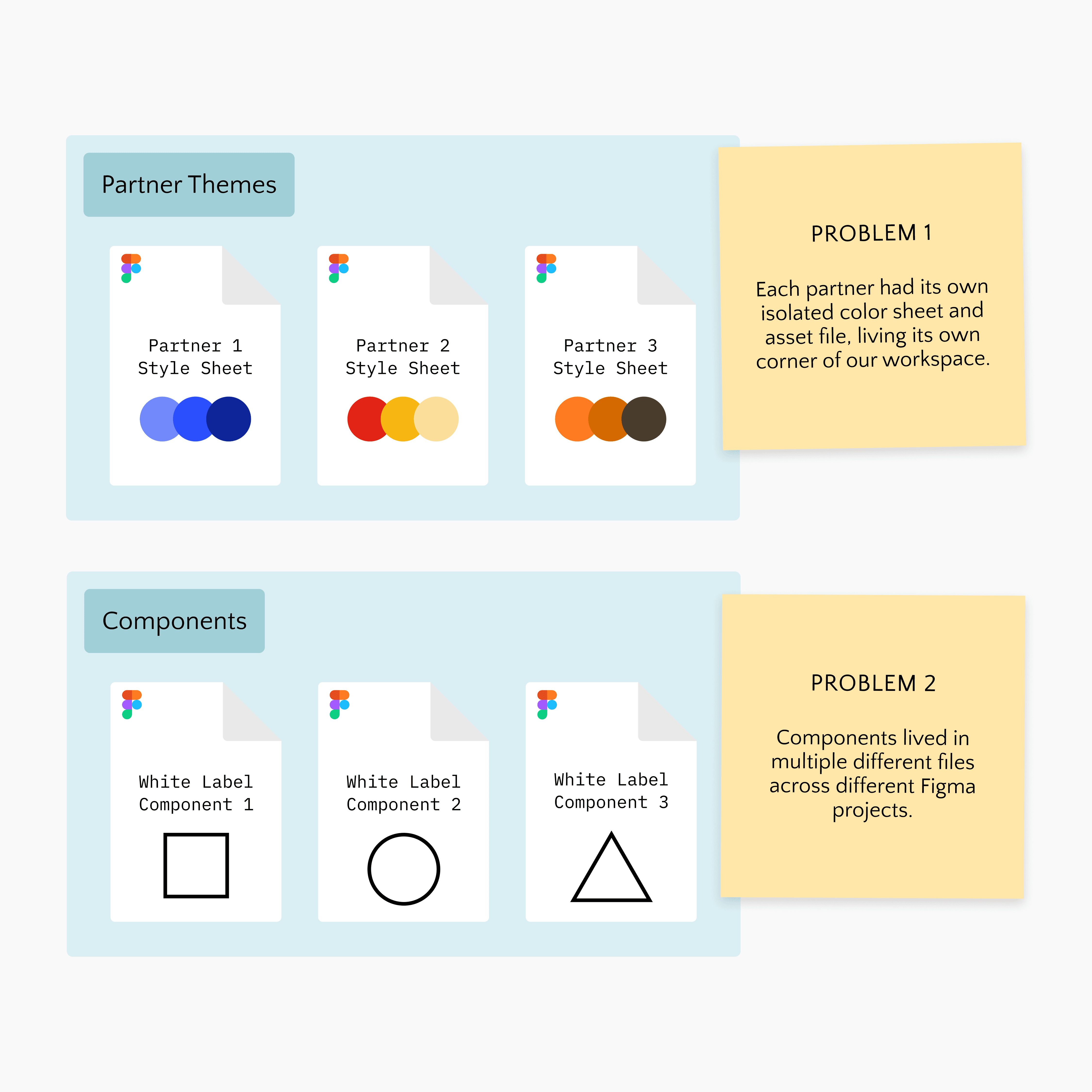
Every time we needed to present something to a partner, we had to bring in our white label assets (from wherever they may be) and manually style and skin the entire file.

Research & Discovery
Before designing anything new, we needed to understand the full scope of what already existed. The team and I conducted an audit of components across all existing screens and partner files.
The goal was to find out what was shared, what varied by partner, and what was being duplicated unnecessarily. After our component audit, we took a deep dive into how color was being utilized across partners.
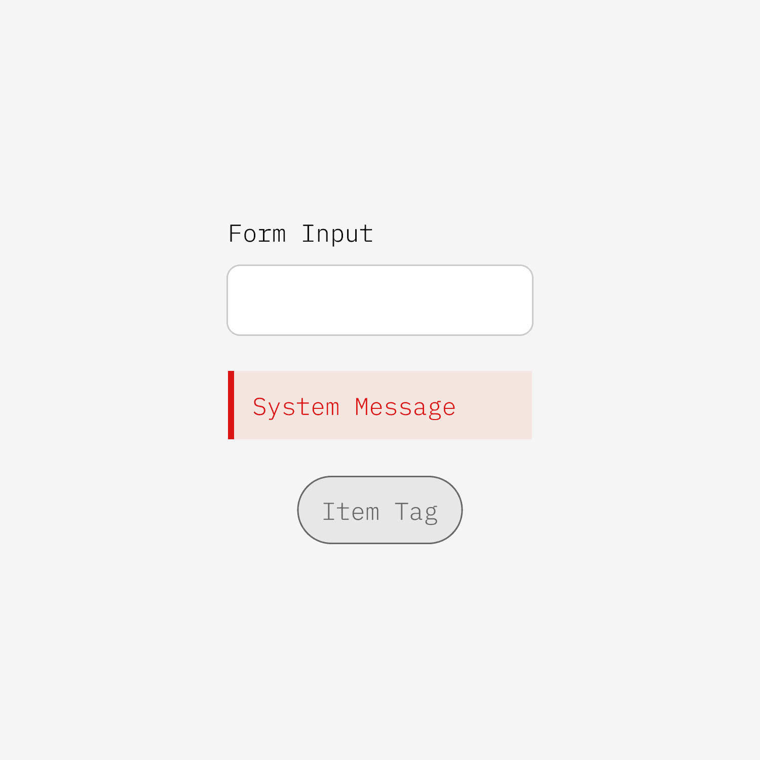
Some elements, like form inputs, utility interactions, and system indicators, behaved the same way regardless of which partner's brand we were working in

Others, like buttons, interactive controls, and logo treatments were partner-specific by nature. There was variation in how brands used their colors; for example, while most brands use their primary color as their main button, we had a handful that did not.

The Process
Step 1: Building the Primitive Color Architecture
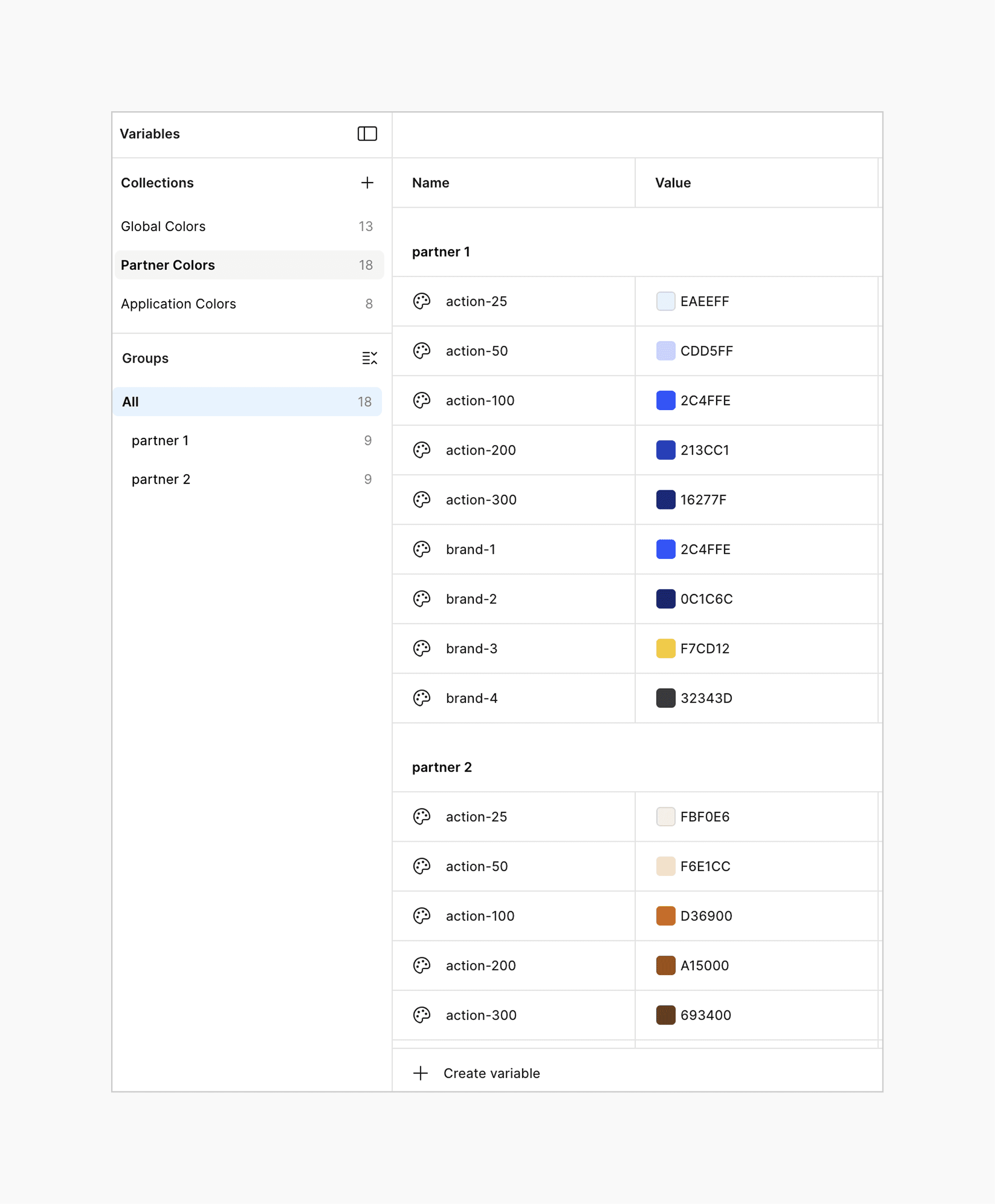
The first and most critical problem to solve was how to organize our color system. With 20+ partners, each with their own brand palette, we needed a structured but flexible system. We decided to break out primitive color structure down into two categories:
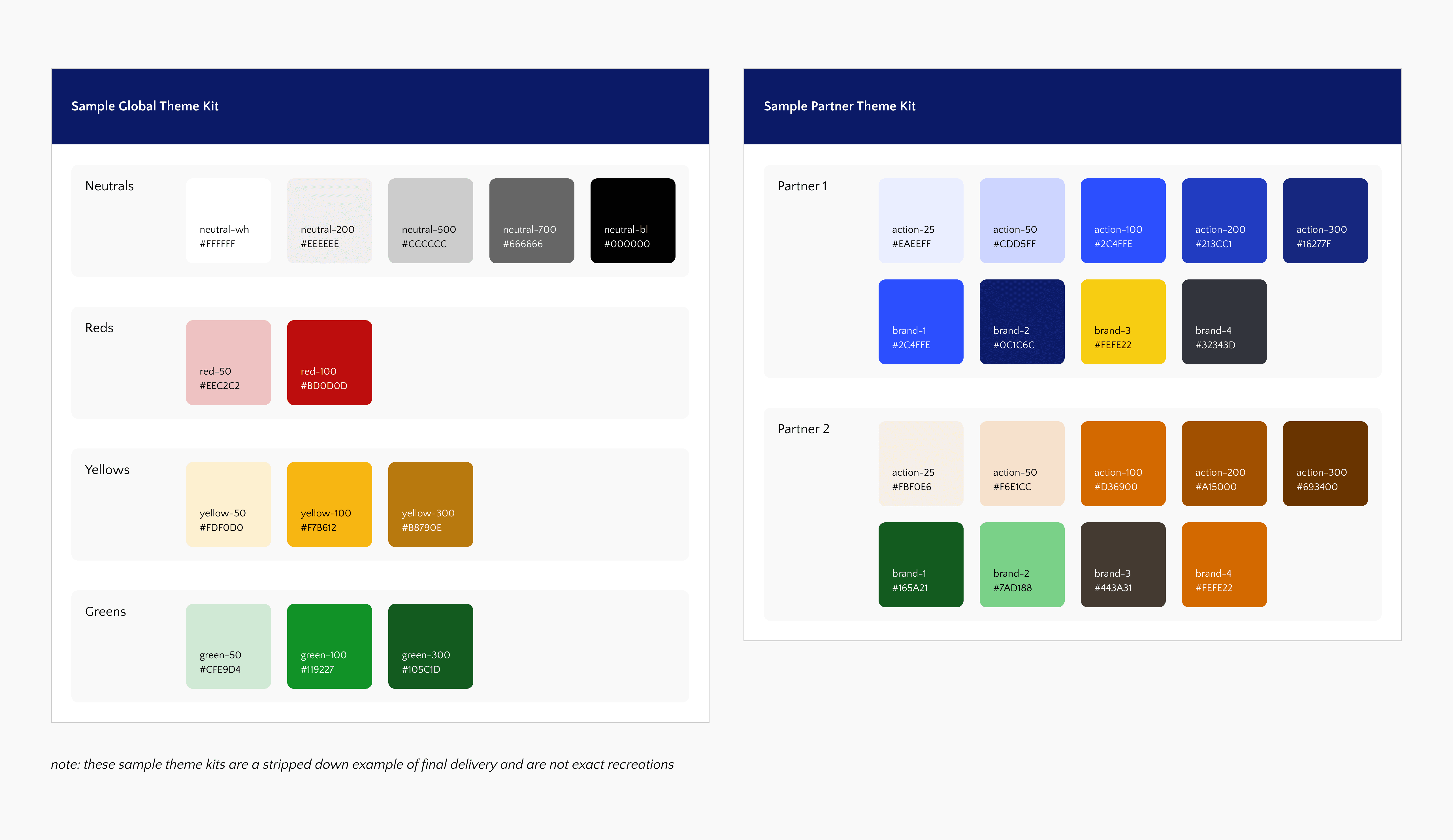
Global Colors
These colors are consistent in every experience regardless of the active partner. This collection consists mostly of neutrals & status indication colors.
Partner Colors
These are the colors that vary by partner. We broke these down into two subsets:
Action Colors are used consistently across all partners for interactive UI elements such as buttons, sliders, controls, etc. Action colors always exist as a gradient to support themed states (default, hover, active, pressed).
Brand Colors represent each partner's unique identity and have the potential to be used differently across implementations. A primary brand color might be used as a header background for one partner and a text accent for another.
The output was a dedicated style sheet for each partner, living inside a single shared Figma library.
This format gave us the structure we were looking for while allowing us the flexibility we needed between partners.

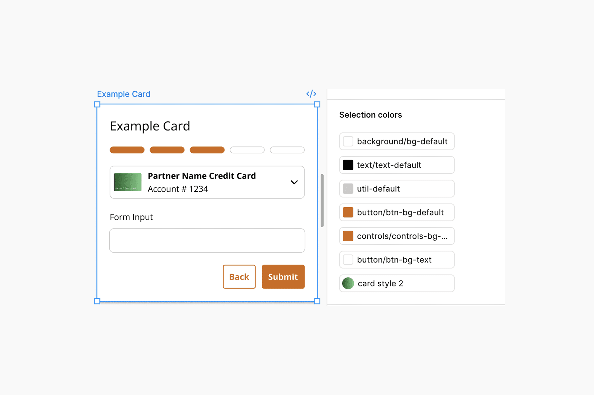
Step 2: Semantic Variables & Figma Theming
The power of this library was going to be in the theming. Each partner would become a mode within a variable set. We would have the ability to link our components just once, and have them easily skinned to any partner in our system using the Figma Appearance panel.
We created a set of semantic variables in Figma that were going to act as a translation layer between our primitive color sets and the components that were to use them.
Since it would be a time consuming task to build out each partner's semantic variable set, I invited other members of the design team to take a stab at putting together a partner theme. Since this was a new endeavor for most people on the team, I conducted an interactive workshop that included a step by step guide on how to create a new CRS partner theme and input it into the Figma variables system.

Step 3: Building & Linking a Cohesive Component Library
Before this project, components were scattered across individual partner files. Using a component meant finding it, copying it, and hoping it was the latest version.
Together with my team, I led the consolidation of all components into a single, cohesive Figma library.
Every component from every partner file was catalogued and rebuilt to a consistent standard. From this process we produced a comprehensive inventory of all global and branded UI elements.

Once we finalized the creation of all of our elements, we applied our new semantic variables to our components. Each component was now linked to a semantic variable, meaning that we built components for all 20+ partners.
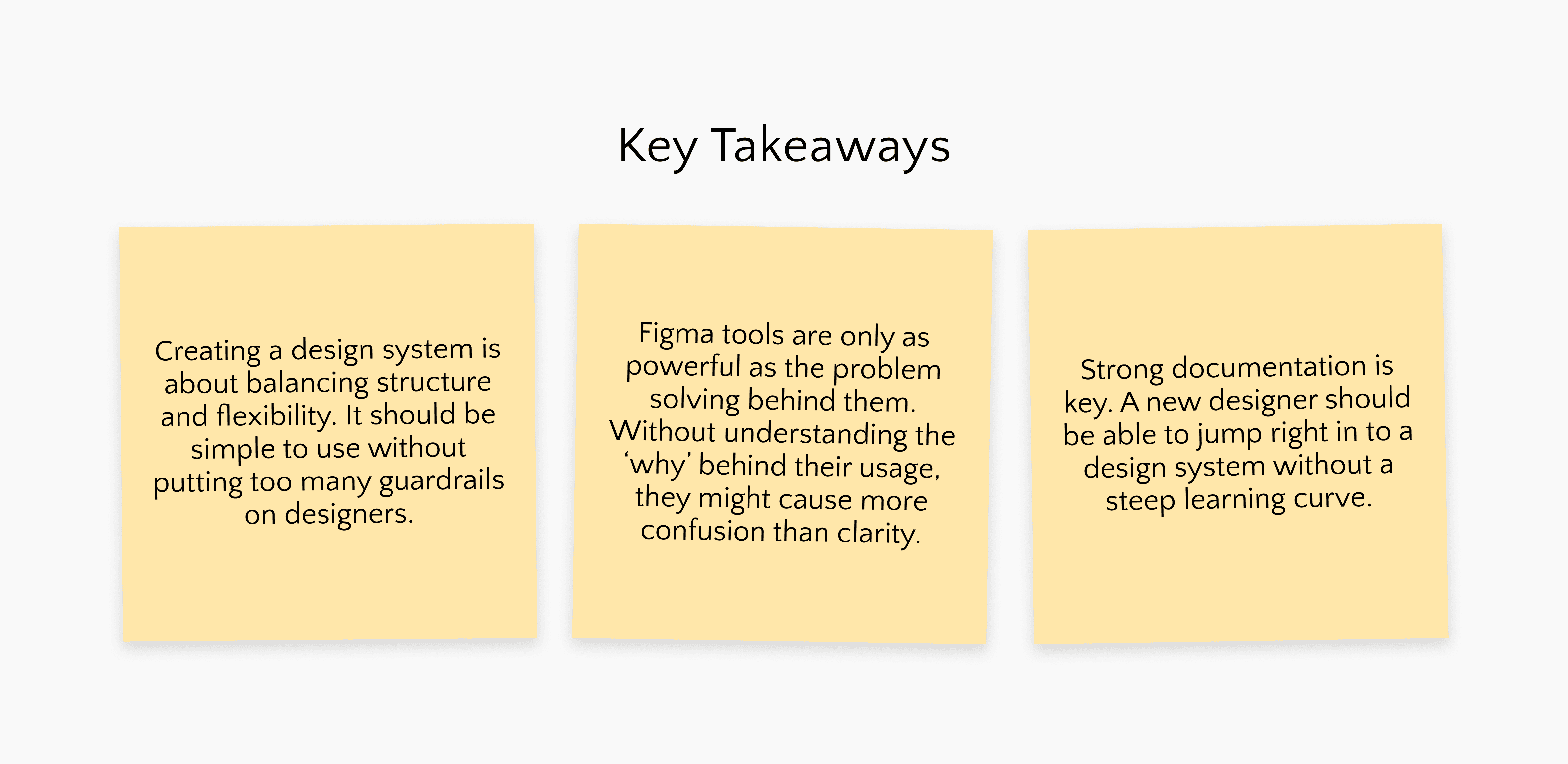
Outcomes & Impact
From Hours to Minutes
The most immediate and measurable outcome was time. What previously required one to two hours of manual styling per partner deliverable - pulling colors, swapping assets, hunting down the right file - was reduced to ten minutes or less. This was a fundamentally different way of working for the CRS design team.
A System Built to Grow
Beyond raw time savings, the system fundamentally changed how we think about scaling. Instead of building a new file and manually building out styles when a new partner joins the roster, its a simple matter of defining primitive colors, adding a new mode to the variable set, and letting Figma do the rest. Every component, asset, & screen automatically adapts.